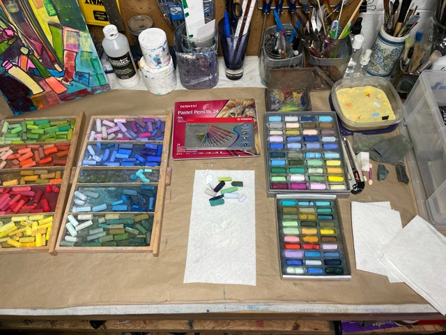
I’ve laid out my materials, working with primarily with Terry Ludwig, Diane Townsend pastels. In addition I pulled some drawers with Rembrandt and Sennelier pastels just in case I need additional colors to choose from.
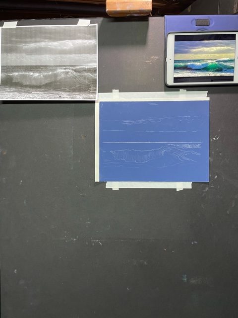
I set up my easel taping my UArt pastel paper to black foam core board, and printed black and white of my original photo for value reference. I put up my iPad with my photo reference and was ready to start. I had previously used a light blue pastel pencil to sketch in a rough idea of the seascape.
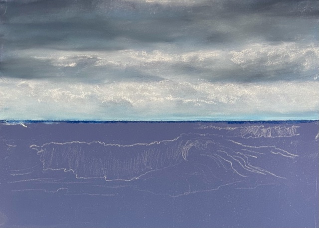
My preference when doing a seascape is to work form top to bottom, so sky in first using dark blues, lighter blue greys, light violet blue, and a soft white.
I continue to work on the sky and then move down, establishing the horizon line with a dark blue violet, before using ultramarine blue and lighter blues for background sea. Moving on to the waves, I start with the dark values under the waves then lighter blue greys, greens and a bit of yellow green and yellow.
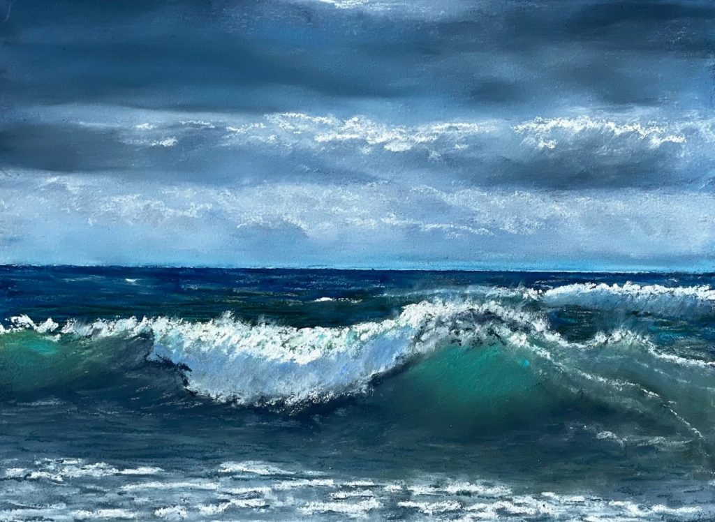
As you can tell, I continued working the sky and background sea while most of the focus was on finishing the waves that entailed glazing, layering, blending what I call “sea colors.” I work toward an impressionistic version of my original photo and when I come to a place that “speaks” to me I call it done.